Posts

Showing posts from September, 2017

Typography project

Image
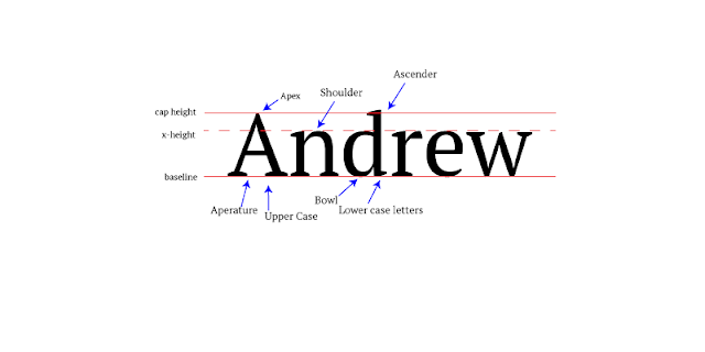
How the Project Was Made: In class for the past couple days we have been learning about typography. Our project this week was to type our name in Serif font and label the parts of the font such as ascenders and descenders. First I went into Adobe Illustrator and typed my name. Afterwards, I created three lines, one at the top being the Cap Height, another as the baseline, and a third dotted called the x-height. Once I had finished with that, I created some arrows pointing at specific parts of the letters and labelled them as apex, shoulder, ascender, baseline, x-height, cap height, aperture, Upper case, bowl, and lower case letters. I then saved the picture as a PNG-24 and saved it for web. What I learned: Throughout the project I learned how to format more on Illustrator. I also learned that some fonts are used formally, casually, and decoratively. The formal font is usually Serif, the casual is usually Sans Serif, and decorative is pretty much any font that does not really seem l

Logo Color Schemes

Image
Analogous Color Schemes This Logo uses the analogous colors of green, yellow, and yellowish green. I think this company uses these colors due to it being a gas company and wanting to make people think they are really environmentally friendly with these specific colors. This logo uses red, orange, and reddish orange. These colors make the logo stand out compared to other colors as they are loud. Complementary color schemes This logo uses Blue and Orange. This scheme is used by many sports teams for a couple reasons it makes their uniforms easier with just two colors and the Fans can pick one of the colors. This logo uses the colors red and green. These colors are also the colors a chili pepper making it fairly easy to assume why these colors were chosen. Warm Colors The colors used here are red and yellow. These are colors used in many restaurants due to their appeal and warmth. The LEGO logo uses the colors red and yellow. They

Color Wheel Activity in Adobe Illustrator

Image
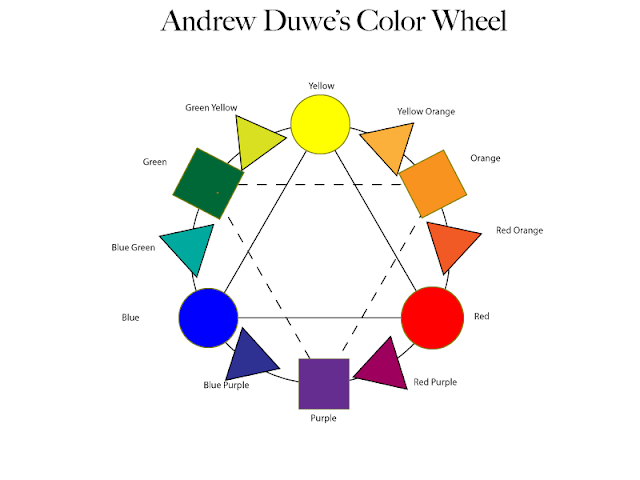
This past week in class we have been learning how to use Adobe Illustrator by creating a color wheel on it. We got started by creating a big circle and placing two large triangles inside it with one being upside down and dotted. After that we created three smaller circles and placed them on the points of the not dotted triangle. They were colored Blue, Yellow, and Red, the primary colors. On the other triangle's points we placed upon them three squares, colored Purple, Orange, and Green, these are the secondary colors and were placed in between the two colors that make the color. Following that there were the Tertiary Colors which was a mix of the secondary and primary colors which resulted in six triangles. The project was then saved and exported as a PNG-24. What I learned this past week was how to use everything in Illustrator, it is actually fairly complicated but I assume that I will eventually get the hang of it. I also learned what a tertiary color was, along with comple