Graphic Design Final
The Projects themselves
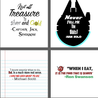
The first project was my typography project. In that project I had to choose 4 quotes that I felt described me. The project roughly took close to two weeks to complete. I found it to be fairly easy. The hardest part was actually a fairly simple part, the color schemes. It was tough to find colors that worked well together. During the project I learned how to utilize typography effectively to make the quotes pop. Mrs. Beaudoin gave me good advice on colors and what looked good. I changed the Ron Swanson quote because of the type of food visual I wanted to use. Overall I liked the look of the project and especially the Han Solo quote.

The second project was the vector illustration of myself. This project was the one where I had to choose a picture of myself (the one I chose was truly majestic) and use the pen tool, something I was seriously inexperienced with, to illustrate it into a graphic. The overall project was fairly challenging, my biggest challenge was the blending of the different shades on my face because there were a TON of separate shades of color. Mrs. Beaudoin was able to help me with that very well and gave me good guidance on how to blend those well. I ended up changing the color of the background to orange. Overall I loved my project it was truly most triumphant. The project took a couple weeks.


My third and final project was creating a poster and other promotional stuff for an imaginary concert tour of the excellent group "The Lonely Island." The project took close to a month. Some challenges I faced was utilizing the color schemes and style of the poster. Mrs. Beaudoin was able to give me some good ideas on how I can change the design and especially the poster, that was the toughest part as it was the basis of all the other parts. Overall it was truly majestic and I had a good time, the project looks good too.


how did I use my class time
In class I utilized my class time actually pretty well. If I finished early, as was the case with my vector illustration. When I finished that I decided to try and improve my skills by creating a second vector illustration of the excellent Captain Jack Sparrow. The day after I finished a project, I would examine it that day and see what I could fix up and change, and then I would turn it in. Overall I felt I was very productive (I will admit though, I had Brooklyn 99 on in the background most days, it motivated me to keep working).
My strengths as an ecomm student
Now that I have been in ecomm for two years, I can say that I have developed some good skills in certain areas of ecomm. I have become pretty good at video and some areas of graphic design such as the pen tool. I didn't start graphic design this year until January because I most non-triumphant at animation and because I wanted to stay in Mr Cooper's class in second semester.
Areas to improve on
I need to definitely improve on some certain areas of all classes. In graphic design, I need to improve on my photoshop skills and my skills in Indesign. In video I could improve on my storyboarding skills because I am truly awful at that. I also need to plan out my shoots a bit better than I have been.
Conclusion
I really liked the amount of creative freedom I had in this class. Other classes I have taken have given me less creative freedom, which is something I really enjoy having maybe more than most. I wouldn't really change anything about my experience in this class, it was overall pretty great. Next year I would like be slightly more ambitious with my projects. Other than that I have no other thoughts, just be excellent to each other and party on dude!


Comments
Post a Comment