Posts

How to Print video project

Image
The Process What we did to start was create a storyboard. In that storyboard we had an idea to have one of us print of a page and then we fly down the halls in a spinny chair. We all then realized how unprofessional it was so we then decided to just have it so we just print off the page and then walk down to the library printer. Once we had that figured out we took pictures of shots we would use on an iPad. We took turns taking the pictures. After we had done that and put them into a powerpoint/google slides presentation showing what types of shots were in the video and what the viewer was seeing. Once that was done we shot the video clips on another iPad. Finally, we put them into Adobe Premiere Pro and edited the clips into one video. Once done with that t was uploaded to YouTube. Other Stuff We used the Five Guarantees of e-comm quite a bit. For Technical Skills, we needed those in using iPads and Adobe Premiere Pro, a program most of us hadn't touched before. Communicati...

Website Project

Image
How the Project Was Done Before we even started on the project we needed to create a folder compiling all of my major projects along with a photo of myself. The folder also included an html file and a CSS file for the style. All of this was in the server. Then we opened Dreamweaver and used the html file and learned a bit about the code stuff, then we inserted the CSS file and that changed the design a ton. After that was done we created our sidebar and the stuff on there such as the menu and links (which has a special surprise if you click for some smooth jazz to balance it out).  On the home page I inserted the photo of myself and pasted my "Elevator Pitch" into it.  I then went to the projects page and inserted some gifs and photos of my projects along with their blog post with it. Finally at last I had all of my main website done now all I had to do was some designing, I colored my background, sidebars, and titles. By that point I am pretty sure I was done. What I ...

Sketchup house

Image
How I did it I started by finding a house on Houseplans.com that was over 500 square feet. Once I picked my house (which took quite a while to be honest), I created a giant rectangle using the house's width and depth. I then set the height to the height listed on the house plan. From there I created the roof and a few windows. But thenI realized I had been doing it wrong for the past week so I had to restart the entire process, which was pretty dang hard. I then created windows, a door, a roof, and an epic interior Shrek shrine. What I Learned I learned how to fully use sketch up and the power of perseverance. Next time I may see if I can find a house plan that looks the same in pictures of the house and the plan because my house had that problem. The house plan looked very different from the house. Something I think I did very well was the windows, those were very time consuming. Something I would do the sam is the door and windows, I am very proud of those. ...

The Bouncy Ball Project Thingy

How We Did Each Thingy Last week we started something new in photoshop, frame animations. It reminds me a slight bit of stop motion but it is not really pictures at all. Restarted by using the paint brush tool, and made the paint brush style for grass instead of a standard brush. The brush's colors also are varied between a dark and light green. Then we painted it as grass. After, we created a circle that looked like a ball and changed its opacity to about 37 percent and created its path, using option drag. We then created a frame animation and went frame by frame showing only one ball at a time using the eye icon.  We really honestly did that for every animation for this project. What was learned We learned this past week how to create frame animations, something I did not really know how to do. Sometimes it got a bit tricky though because the layers would occasionally pop up in other frames and then I would make those go away and they would all go away. It got fairly tri...

Ten Words Animation

Image
What Happened Last week in class we worked on an animation for the ten words that describe me. What we did was use Adobe Photoshop, which actually surprised me as I had no idea it could be used for that. We first typed out our names and the ten words and organized them. After that, we started actually animating, which was mostly having the word offscreen and then moving a few seconds and moving the word into where it would be at that point, it is a bit hard to explain. What I Learned I learned how Photoshop could be used to animate and create video. That was the most surprising to me. I also learned a different way to animate as I used to only know how to animate through stop motion with Legos. If I could anything differently it would be to have organized the words differently and more creatively. I personally don't think I was creative enough with it. Next time I will still ask questions when I don't understand something. I will also remember what I did here in future p...

Logo Project

Image
How we did the project: The past week and a half we have been making our own logos in class. We started the process by doing some sketches for a day or two. Then we took them into adobe illustrator and learned how to use anchors and stuff like that for the project. We began by making them but only in black and white because if it looks terrible in black and white, the logo is probably not good. That went on for a couple days and we then. were able to use color, which required a lot of option-drag to test out new things. Once we finally decided on our logo we would copy it into a new art board. Finally, we exported it for web. Why though?   This logo didn't use an actual font surprisingly, it was really a combination of lines and empty space. I used the triangle because I realized I can utilize it to make an "A" by its empty space. The arrow part of the logo really was used because the triangle can be fit on top and I thought the triangle looked strange on its own. ...

Typography project

Image
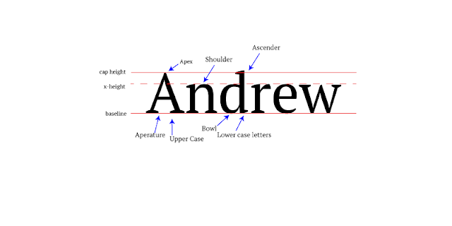
How the Project Was Made: In class for the past couple days we have been learning about typography. Our project this week was to type our name in Serif font and label the parts of the font such as ascenders and descenders. First I went into Adobe Illustrator and typed my name. Afterwards, I created three lines, one at the top being the Cap Height, another as the baseline, and a third dotted called the x-height. Once I had finished with that, I created some arrows pointing at specific parts of the letters and labelled them as apex, shoulder, ascender, baseline, x-height, cap height, aperture, Upper case, bowl, and lower case letters. I then saved the picture as a PNG-24 and saved it for web. What I learned: Throughout the project I learned how to format more on Illustrator. I also learned that some fonts are used formally, casually, and decoratively. The formal font is usually Serif, the casual is usually Sans Serif, and decorative is pretty much any font that does not really seem l...