Posts

The Bouncy Ball Project Thingy

How We Did Each Thingy Last week we started something new in photoshop, frame animations. It reminds me a slight bit of stop motion but it is not really pictures at all. Restarted by using the paint brush tool, and made the paint brush style for grass instead of a standard brush. The brush's colors also are varied between a dark and light green. Then we painted it as grass. After, we created a circle that looked like a ball and changed its opacity to about 37 percent and created its path, using option drag. We then created a frame animation and went frame by frame showing only one ball at a time using the eye icon.  We really honestly did that for every animation for this project. What was learned We learned this past week how to create frame animations, something I did not really know how to do. Sometimes it got a bit tricky though because the layers would occasionally pop up in other frames and then I would make those go away and they would all go away. It got fairly tri...


Ten Words Animation

Image
What Happened Last week in class we worked on an animation for the ten words that describe me. What we did was use Adobe Photoshop, which actually surprised me as I had no idea it could be used for that. We first typed out our names and the ten words and organized them. After that, we started actually animating, which was mostly having the word offscreen and then moving a few seconds and moving the word into where it would be at that point, it is a bit hard to explain. What I Learned I learned how Photoshop could be used to animate and create video. That was the most surprising to me. I also learned a different way to animate as I used to only know how to animate through stop motion with Legos. If I could anything differently it would be to have organized the words differently and more creatively. I personally don't think I was creative enough with it. Next time I will still ask questions when I don't understand something. I will also remember what I did here in future p...

Logo Project

Image
How we did the project: The past week and a half we have been making our own logos in class. We started the process by doing some sketches for a day or two. Then we took them into adobe illustrator and learned how to use anchors and stuff like that for the project. We began by making them but only in black and white because if it looks terrible in black and white, the logo is probably not good. That went on for a couple days and we then. were able to use color, which required a lot of option-drag to test out new things. Once we finally decided on our logo we would copy it into a new art board. Finally, we exported it for web. Why though?   This logo didn't use an actual font surprisingly, it was really a combination of lines and empty space. I used the triangle because I realized I can utilize it to make an "A" by its empty space. The arrow part of the logo really was used because the triangle can be fit on top and I thought the triangle looked strange on its own. ...

Typography project

Image
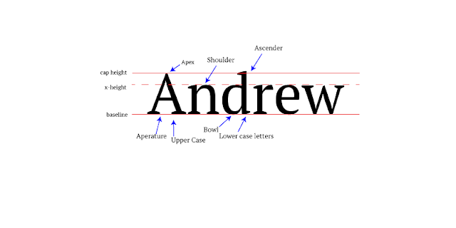
How the Project Was Made: In class for the past couple days we have been learning about typography. Our project this week was to type our name in Serif font and label the parts of the font such as ascenders and descenders. First I went into Adobe Illustrator and typed my name. Afterwards, I created three lines, one at the top being the Cap Height, another as the baseline, and a third dotted called the x-height. Once I had finished with that, I created some arrows pointing at specific parts of the letters and labelled them as apex, shoulder, ascender, baseline, x-height, cap height, aperture, Upper case, bowl, and lower case letters. I then saved the picture as a PNG-24 and saved it for web. What I learned: Throughout the project I learned how to format more on Illustrator. I also learned that some fonts are used formally, casually, and decoratively. The formal font is usually Serif, the casual is usually Sans Serif, and decorative is pretty much any font that does not really seem l...

Logo Color Schemes

Image
Analogous Color Schemes This Logo uses the analogous colors of green, yellow, and yellowish green. I think this company uses these colors due to it being a gas company and wanting to make people think they are really environmentally friendly with these specific colors. This logo uses red, orange, and reddish orange. These colors make the logo stand out compared to other colors as they are loud. Complementary color schemes This logo uses Blue and Orange. This scheme is used by many sports teams for a couple reasons it makes their uniforms easier with just two colors and the Fans can pick one of the colors. This logo uses the colors red and green. These colors are also the colors a chili pepper making it fairly easy to assume why these colors were chosen. Warm Colors The colors used here are red and yellow. These are colors used in many restaurants due to their appeal and warmth. The LEGO logo uses the colors red and yellow. They...

Color Wheel Activity in Adobe Illustrator

Image
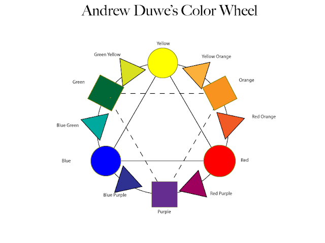
This past week in class we have been learning how to use Adobe Illustrator by creating a color wheel on it. We got started by creating a big circle and placing two large triangles inside it with one being upside down and dotted. After that we created three smaller circles and placed them on the points of the not dotted triangle. They were colored Blue, Yellow, and Red, the primary colors. On the other triangle's points we placed upon them three squares, colored Purple, Orange, and Green, these are the secondary colors and were placed in between the two colors that make the color. Following that there were the Tertiary Colors which was a mix of the secondary and primary colors which resulted in six triangles. The project was then saved and exported as a PNG-24. What I learned this past week was how to use everything in Illustrator, it is actually fairly complicated but I assume that I will eventually get the hang of it. I also learned what a tertiary color was, along with comple...

Sidewalk Chalk Activity

Image
         The past few days in class we have been doing a sidewalk chalk activity with people we have never met in our lives. The was an interesting experience, almost as interesting as what we actually drew on the sidewalk. The project itself made us each choose a symbol that we believe symbolizes us. For me, that was a turtle. A turtle symbolizes endurance, persistence, and continuing life against all odds. I chose hat for a few those reasons but mainly because a turtle is my favorite animal and I asked a magic 8 ball if I was supposed to be a turtle and it said yes. The other three people chose a rose, sparkle (or sprinkles it was never too clear) and a bumble bee. I honestly don't know why they chose those but I bet they have their own reasons.          When we had to start drawing up our design we had trouble deciding at first and even throughout the entire project because we constantly got off task joking around. At first our proje...